
Showing posts with label visualization. Show all posts
Showing posts with label visualization. Show all posts
Thursday, December 20, 2012
Civilization
Doing data visualization is kind of trendy these days but that doesn't mean it isn't fun. Here's something I whipped up that maps US counties by population density vs. % Democratic vote in the last election. Interactive version with map is here.
 It's no surprise that denser areas (note the log scale) tend to vote more Democratic, although it was a bit startling how pronounced the correlation is. If you ignore the small smattering of low-density counties that went Democratic (and pretty much all of them are areas dominated by a racial minority) then it's almost perfect. One party represents urban cosmopolitans (that is, the civilized, which just means living in cities) and the other rural hicks.

Sunday, December 06, 2009
Afghan Highs
For some reason these two bits of intel on Afghanistan seemed worth putting side by side.
First: Afghanistan is not a country; but a collection of tribal areas. It may be defined as that part of central Asia that has historically been resistant to conquest by empires. One unifying factor is that most of the men are constantly stoned on the locally produced high-potency opium and hashish.
(via Digby) Is this accurate? Dunno, sounds plausible, if I had to live in the Afghan tribal areas I'd probably want to be high most of the time. On the other hand, it's hard to square this picture with the Afghani's reputation as fierce fighters.
So, that's a view of Afgahnistan from the ground level. Meanwhile, perched on the commanding heights of a modern-day massive bureaucratic war machine, the American would-be benevolent rulers get high on insane business graphics (via Yglesisias). Something this fucked up could only be generated by people who were huffing too much white-board marker fumes.

Full PDF report here. I have an ongoing debate with a colleague about the value of graphics and visualizations, including some tangled network diagrams like this which are common in systems biology. I'm generally pro-pretty-pictures, but this is a great piece of evidence for his side. Measurement is pretty tricky in biological systems, but at least you know there is something real going on that could in theory be measured, like the amount of mRNA being made off a particular gene. In this chart, you have somthing like "coalition force density" -- which presumably could be an objective number, albeit not a very meaningful one -- is combined with variables like "indivdual competence, judgement, and ability to execute" and "ANSF Corruption & Tribal Favoritism", which can't possibly be defined tightly enough to be measured. So what is the point of this, other than to highlight what a hopless morass fighting a counterinsurgency warfare in mountainous country half a world away where we don't speak the language, understand the culture, or have an idea for an endpoint or exit strategy? None of those arrows point to an exit.
First: Afghanistan is not a country; but a collection of tribal areas. It may be defined as that part of central Asia that has historically been resistant to conquest by empires. One unifying factor is that most of the men are constantly stoned on the locally produced high-potency opium and hashish.
(via Digby) Is this accurate? Dunno, sounds plausible, if I had to live in the Afghan tribal areas I'd probably want to be high most of the time. On the other hand, it's hard to square this picture with the Afghani's reputation as fierce fighters.
So, that's a view of Afgahnistan from the ground level. Meanwhile, perched on the commanding heights of a modern-day massive bureaucratic war machine, the American would-be benevolent rulers get high on insane business graphics (via Yglesisias). Something this fucked up could only be generated by people who were huffing too much white-board marker fumes.

Full PDF report here. I have an ongoing debate with a colleague about the value of graphics and visualizations, including some tangled network diagrams like this which are common in systems biology. I'm generally pro-pretty-pictures, but this is a great piece of evidence for his side. Measurement is pretty tricky in biological systems, but at least you know there is something real going on that could in theory be measured, like the amount of mRNA being made off a particular gene. In this chart, you have somthing like "coalition force density" -- which presumably could be an objective number, albeit not a very meaningful one -- is combined with variables like "indivdual competence, judgement, and ability to execute" and "ANSF Corruption & Tribal Favoritism", which can't possibly be defined tightly enough to be measured. So what is the point of this, other than to highlight what a hopless morass fighting a counterinsurgency warfare in mountainous country half a world away where we don't speak the language, understand the culture, or have an idea for an endpoint or exit strategy? None of those arrows point to an exit.
Sunday, February 24, 2008
America the weird

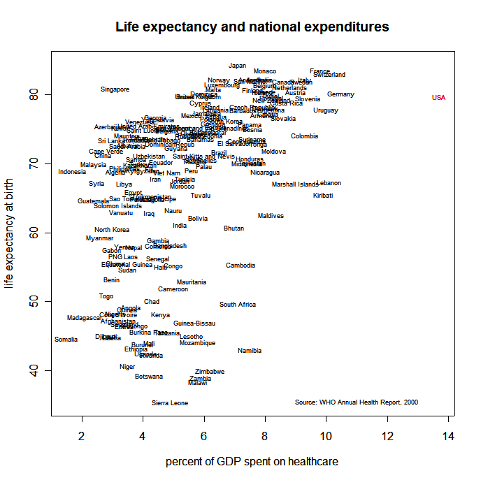
The US is just a fucking weird place. I seem to be constantly stumbling over graphic reminders of this. Here's yet another scatterplot, this time of religiosity vs. per-capita GDP. Here's the source, an article by Alan Wolfe in the Atlantic that claims we shouldn't worry about religious conflict, because Jihad is going to merge with McWorld and give us Americanized McReligions in the model of Rick "Purpose-driven" Warren, that are more interested in self-improvement than holy war. I suppose that's a positive vision.

Tuesday, December 06, 2005
UML kills me
So I'm being forced to sit through a long and tedious course on UML, taught by a guy who probably hadn't started high school when I first began doing object-oriented programming. It's 80% tedium, 10% idiocy, and maybe 10% useful (if you accept that UML can actually be a useful communications tool, which I do).
So yeah, a standard visual notation for expressing software designs is a good thing. Nonetheless UML appears supremely braindamaged to me, for many reasons:
- the presentation of UML seems inextricably linked to a particular notion of software development process. Thus, you have diagram types that are sort of similar (concept and class diagrams) but whose main difference is that they are intended to be used at different phases of the process (analysis and design). Unnecessarily redundant, and they are close enough to each other to cause cognitive confusion.
- UML concepts are loose, vague, sloppy, and weirdly named. For instance, "attributes" and "associations". Both of these are (ultimately) links between an object and something else, but the first is used for primitive types and the latter for object-object relationships. Argh. But actually, when I quizzed the presenter about this, he said that associations turn into "association attributes" or maybe it was "Attribute associations". Double argh.
- UML is a visual language, but the tools used to create diagrams all suck like a black hole. OK, maybe they don't all suck, I haven't tried them all, but Visio and ArgoUML and Rational Rose do. They all have one or more of: lousy UIs, missing features, idiosyncratic notation (to pile on top of the built-in idiosyncracies of UML).
- Since the tools suck in different ways (for instance, ArgoUML is actually sort of OK but is missing some of the diagram types), it might be possible to compensate by using more than one and passing the UML between them. Ha. UML is a well-established industry standard, right? You'd think that as a standard, it might be possible to write out a UML diagram from one UML editor and read it in with another. You'd be wrong. There is NO established serialization format for UML. This I find amazing and hard to understand even taking UML on its own terms.
- Related, but getting more philosophical, UML constantly fudges the extent to which it is trying to be a formal language. On the one hand, we are just drawing pretty pictures so the marketing guys can see what we are doing. On the other hand, we introduce all sorts of details that suggest we are really writing code, like public/private indicators on attributes. And then everybody tries to make tools that can do "round trip engineering" and go back and forth from UML to code (I've never seen one of these work).
- There's some undefineable grating quality about all discourse surrounding UML. I think it's related to the above, its attempting to straddle the gap between actual code and something else. This something else might be "business" but if so it's expressed in some way I don't understand.
I guess I'm extra miffed because I actually like diagrams and visual programming, but it seems to be that we have a case of a poor standard sucking all the air out of the space of visual object oriented programming. Also, I completely agree with what I see as the main goal of UML, which is enhanced communication between engineers and customers/domain experts. Again, I just think this is an abysmal way to go about it. Object-oriented programming is supposed to do this in itself, without an extra layer of sloppily-defined cruft.
Maybe I'm just missing some sort of business-oriented DNA. I went through an experience some years ago, where I (and my cow-orkers) first encountered relational databases. Everybody there was from sheltered academic environments where we had never seen such a thing before, and we regarded mostly with hostility and didn't make very good use of it. Eventually I had an epiphany where I finally got the value of the relational model, and understood how real-world applications might actually be interested in data. Perhaps UML similarly has value that is just hidden from me due to my lack of appropriate background, although I doubt it.
Keyword: venting,
Google fodder: UML sucks
So yeah, a standard visual notation for expressing software designs is a good thing. Nonetheless UML appears supremely braindamaged to me, for many reasons:
- the presentation of UML seems inextricably linked to a particular notion of software development process. Thus, you have diagram types that are sort of similar (concept and class diagrams) but whose main difference is that they are intended to be used at different phases of the process (analysis and design). Unnecessarily redundant, and they are close enough to each other to cause cognitive confusion.
- UML concepts are loose, vague, sloppy, and weirdly named. For instance, "attributes" and "associations". Both of these are (ultimately) links between an object and something else, but the first is used for primitive types and the latter for object-object relationships. Argh. But actually, when I quizzed the presenter about this, he said that associations turn into "association attributes" or maybe it was "Attribute associations". Double argh.
- UML is a visual language, but the tools used to create diagrams all suck like a black hole. OK, maybe they don't all suck, I haven't tried them all, but Visio and ArgoUML and Rational Rose do. They all have one or more of: lousy UIs, missing features, idiosyncratic notation (to pile on top of the built-in idiosyncracies of UML).
- Since the tools suck in different ways (for instance, ArgoUML is actually sort of OK but is missing some of the diagram types), it might be possible to compensate by using more than one and passing the UML between them. Ha. UML is a well-established industry standard, right? You'd think that as a standard, it might be possible to write out a UML diagram from one UML editor and read it in with another. You'd be wrong. There is NO established serialization format for UML. This I find amazing and hard to understand even taking UML on its own terms.
- Related, but getting more philosophical, UML constantly fudges the extent to which it is trying to be a formal language. On the one hand, we are just drawing pretty pictures so the marketing guys can see what we are doing. On the other hand, we introduce all sorts of details that suggest we are really writing code, like public/private indicators on attributes. And then everybody tries to make tools that can do "round trip engineering" and go back and forth from UML to code (I've never seen one of these work).
- There's some undefineable grating quality about all discourse surrounding UML. I think it's related to the above, its attempting to straddle the gap between actual code and something else. This something else might be "business" but if so it's expressed in some way I don't understand.
I guess I'm extra miffed because I actually like diagrams and visual programming, but it seems to be that we have a case of a poor standard sucking all the air out of the space of visual object oriented programming. Also, I completely agree with what I see as the main goal of UML, which is enhanced communication between engineers and customers/domain experts. Again, I just think this is an abysmal way to go about it. Object-oriented programming is supposed to do this in itself, without an extra layer of sloppily-defined cruft.
Maybe I'm just missing some sort of business-oriented DNA. I went through an experience some years ago, where I (and my cow-orkers) first encountered relational databases. Everybody there was from sheltered academic environments where we had never seen such a thing before, and we regarded mostly with hostility and didn't make very good use of it. Eventually I had an epiphany where I finally got the value of the relational model, and understood how real-world applications might actually be interested in data. Perhaps UML similarly has value that is just hidden from me due to my lack of appropriate background, although I doubt it.
Keyword: venting,
Google fodder: UML sucks
Subscribe to:
Posts (Atom)